I'm Gyurim, a designer who creates user-centric products having responsibility even for a single pixel.👋🏻
Scroll Me
Scroll Me
Let me introduce my meaningful experiences!

2008.03-2011.02
2011.03-2015.02
4.22 / 4.5(Final G.P.A)
B.F.A. IN APPLIED ART EDUCATION
2015.03-2017.02
4.5 / 4.5(Final G.P.A)
M.F.A. IN ART EDUCATION
2018.05-2018.10
Digital UX/UI Design Course

2018.11-2019.11
Chief designer
Web/App design and coding
2020.01-2020.03
Chief designer
Web design and online website management
2020.04-2020.07
Chief designer
Web/App design and coding
2021.02-2022.06
Chief designer
Web design and coding
2022.07-currently
Graphic design and teaching Photoshop online
Let me introduce what I can do in detail!

Good design comes from good planning. Just like a phrase "BACK TO BASIC", I put a great importance on planning.

I can do poster, logo, banner, detail page, promotion page in accord with the atmosphere which the company pursues/purpose of making.

I always try to think as users, design interfaces considering usability. I also pursue easy-to-use design which has the importance between each information.

I can materialize flexible webpages which can be applied to device size, by organizing every element's size with percent.

I can organize webpage's overall layout based on DOM structure. I also can make HTML document using DOM, apply CSS style, and active implementation using Javascript/jQuery.

Prior to full-out design, I can find out existing design's problems with my pixel-perfection and endless curiosity, then suggest alternatives to solve them.
-
Isn't there what you want above?
I'm pretty fast in learning new things, so do not worry!
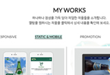
Let me introduce my works! Click each unit to check detailed information.


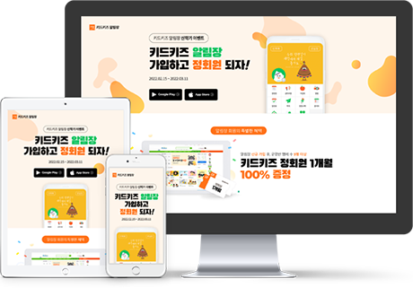
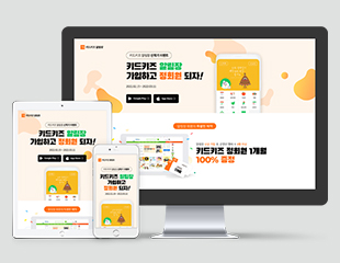
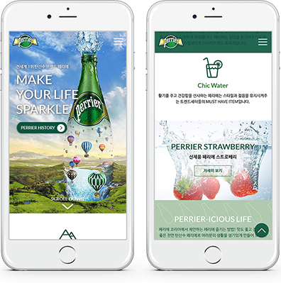
This is a promotional page I created while working at the previous company to advertise the mobile app service. At the time, I prominently featured the newly redesigned app's main screen at the top of the page to spark users' curiosity about the service. The overall color theme was developed using the main colors from the existing app design, following a tone-on-tone color scheme. Additionally, I incorporated the AOS (Animate On Scroll) plugin to add an element of fun to the website.
Benchmarking – Design - Coding
2022
Adobe Photoshop, Adobe Illustrator, HTML/CSS, Javascript, jQuery
#familiarity #warm #easy
Black Han Sans, Noto Sans KR, Montserrat
#FF7117
#FEF5EB
#E5FFED
#04C65F
#D73F34
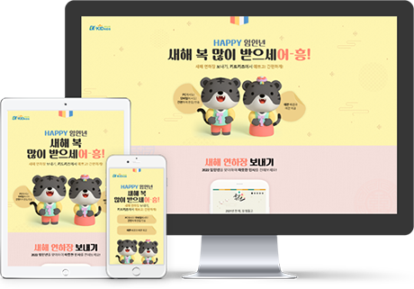
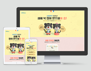
This is a New Year's greeting card promotion page I designed while working at the previous company. I used an illustration of the black tiger, the animal symbolizing 2022, and personally created and inserted the greeting card designs within the device. The page was structured so that after sending the greeting card, users could also browse related New Year's products and services at once. I added fun animation effects to the buttons using the AOS (Animate On Scroll) plugin and completed all the coding work myself before handing it over to the development team.
Benchmarking – Design - Coding
2022
Adobe Photoshop, Adobe Illustrator, HTML/CSS, Javascript, jQuery
#friendly #convenience #easy #dainty
SangjuGotgam, Noto Sans KR
#FFF6b1
#BC8D3C
#F6E1DD
#9A4CD6
#2D5A80
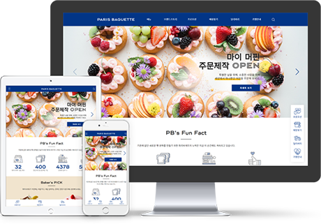
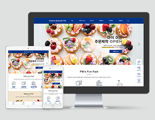
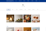
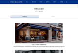
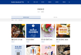
Based on the data analyzing process, renewal of the existing website was chosen as the best way to go. I decided to stick with the wide content size, which enables free expression while enabling good usability. The submenus got redesigned, adding a better English to Korean translation, plus minor naming changes. In order to increase the online conversion rates, I proposed exclusive online promotions.
Benchmarking - Planning – Design - Coding
2018.05.14~2018.06.20
Adobe Photoshop, Adobe Illustrator, HTML/CSS, Javascript, jQuery
#happiness #tasty #trueheart #freshness
PB Gothic, PB Gothic Inline, Noto Sans KR
#023586
#F1E6D0
#E3E7F4
#FDBE10
#B2C4D7
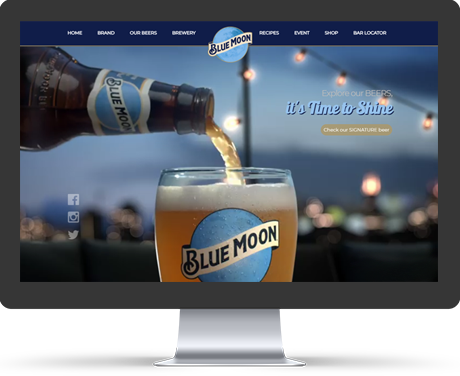
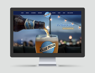
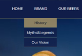
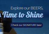
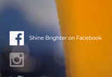
Just like the brand name “Blue moon”, I designed a screen as a moon arising over the clear night sky by arranging the brand logo in the middle of header area. I also used transition property to make the webpage look natural. As main color, I chose purplish Blue of deep tone extracted from current brand logo to create a unified flow in the whole screen. I chose purplish Blue of light tone also extracted from the brand logo to express fresh and cool impression. I made a mild and rich taste of beer using Orange of light grayish tone as point color.
Benchmarking - Planning – Design - Coding
2018.07.18~2018.07.19
Adobe Illustrator, HTML/CSS
#crispness #cool #richness #mild
Montserrat, Galada
#101D49
#96C2EC
#AC9766
#BBBBBB
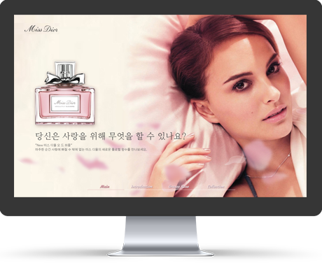
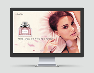
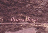
This is main page of Miss Dior perfume which has scroll one page structure. I used "height" function to make the website resize itself, and "mousemove" event to make 2 different petal images move when the mouse moves just like rose petals are floating around. I also made a navigation, so that users can move to each page by clicking each navigation. I added "removeClass" and "addClass" function to navigation which can easily inform users that which page they are in. I added "stop" function in front of "animate" function to get rid of unexecuted events for the website’s usability.
Benchmarking - Planning – Design - Coding
2018.08.30~2018.08.31
Adobe Photoshop, HTML/CSS, Javascript, jQuery
#feminine #fragrant #elegant #delicate
NanumMyeongjo, Gothic A1, Courgette
#E3ABB3
#F8F0F2
#555555
#612636


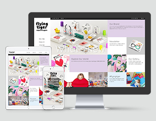
Even though the old website is made as responsive one, it seems too static compared to unique and fun image of the brand. Therefore, I used fonts that can match the charming and cute atmosphere of the brand’s logo itself. I also minimize using many colors to stand out colorful store/product pictures. Hence, I mainly used achromatic colors to make themselves harmonious with pictures used in website, and used Purple which was known as inspirational color. I kept thinking about the brand slogan, “The place filled with surprises” and “Amusing place” and used media query to make the layout change accrording to screen size.
Benchmarking - Planning – Design - Coding
2018.09.28~2018.09.29
Adobe Photoshop, Adobe Illustrator, HTML/CSS
#unique #enjoyment #charming #inspiration
NanumSquare, Noto Sans KR, Quicksand
#212121
#FFFFFF
#E0D1E7
#9865AA


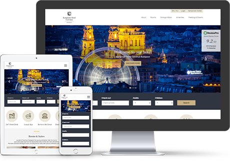
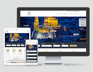
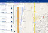
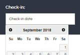
The old Kempinski hotel website looked stuffy because it has too much information in a narrow space. However, in the renewed version of mine, I tried to make full use of the wide space with necessary information for a hotel website. I used Bootstrap for the main slide, and used jQuery UI for the check-in/check-out input boxes. Additionally, I used Swiper slider considering usability for mobile, used media query to make the layout change according to screen size, and tried to properly use display property to make certain area be shown/hidden.
Benchmarking - Planning – Design - Coding
2018.08.14~2018.08.26
Adobe Photoshop, Adobe Illustrator, HTML/CSS, Javascript, jQuery
#relaxation #cozy #convenience
Rubik, Questrial, Frank Ruhl Libre
#ECE6DA
#C8B185
#473A20
#00008B
#303542
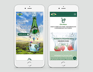
The first purpose of making this mobile web project was making simpler interface with high accessibility considering user experience to make users less tired. The second purpose was making mobile web that can maximize promotion effects for Korean consumers. Through these purposes, the major purpose of making this project was making consumers feel more friendly than competitors, and creating much more revenue of the brand. I maximized usability by using alternative text for the background image, and used vendor prefix for cross browsing.
Benchmarking - Planning – Design - Coding
2018.08.09~2018.08.27
Adobe Photoshop, Adobe Illustrator, HTML/CSS, Javascript, jQuery
#sensibility #smartness #health #refreshing
NanumBarunGothic, Lato
#0C5640
#D7EDE1
#FFFFFF
#CA9501
#377B36


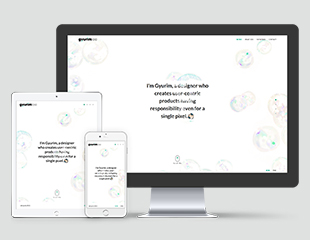
As a UX/UI designer who designs user experience, I wanted to put my own experience in my portfolio. I chose “soap bubble” which reminds me of my childhood as material for this personal portfolio project, and very when I encountered web design for the first time. I made my web portfolio as scroll one page using jQuery, minimized the size of area with the main color to make my works look better. I made moving between categories easy by using jQuery tab menu, and maximized usability by using alternative text in every image. I used PHP to make others can send me an email and text message, and made two language buttons(KOR, ENG) which can change the website’s language mode. Additionally, I used vendor prefix for cross browsing. As main color, I chose bluish Green which is my favorite color. Because the main color has a high chroma, I used achromatic colors for the rest. I also used media query to make the layout change according to screen size. The contents of “MY WORKS” area is continuously being updated.
Benchmarking - Planning – Design - Coding
Updated from time to time
Adobe Photoshop, Adobe Illustrator, HTML/CSS, Javascript, jQuery
#experience #memory #nostalgia
NanumBarunGothic, Lato
#00AA87
#AEE8DC
#D3D3D3
#FFFFFF
#222222
Benchmarking - Planning – Design(+logo design)
2018.10.14~2018.10.22
Adobe Illustrator, Sketch
#eco #convenience #familiarity #easy
Apple SD Gothic Neo, Multicolore
#3C74DF
#62D38F
#EEF2F8
#4C9CBD
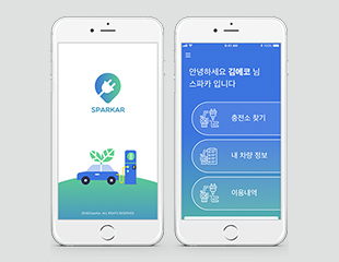
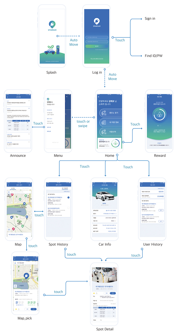
This is mobile application design which was conducted as a group of two. The name of the application, SPARKAR is a compound word of "spark" and "car". We made this simple name which can be pronounced easily, so that users can memorize the name for a long time. This application was made to offer location information of electric charging station for EV drivers. For usability, we put the locations of charging station, and the type of charger which is currently available in each station using icons and text. In addition, we put helpful information such as price tables according to charging time, benefits/promotion news of each station. We conceived an idea of offering 1 free charging coupon for drivers if they charge 12 times using SPARKAR to make them use our application.
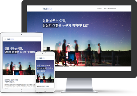
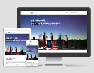
This is a landing page for introducing 'Yolohitch', which is a mobile application for matching travelling companions. I arranged sensitive pictures all over the screen, because 'trip' reminds people of their memories as a material. I chose purplish Blue of light tone from the current CI to express nattiness. I also used media query to make the layout change according to screen size.
Benchmarking - Planning – Design - Coding
2019.07.31~2019.08.04
Adobe Photoshop, Adobe Illustrator, HTML/CSS, Javascript, jQuery
#nattiness #pleasantness #joy
Noto Sans KR
#C8D0F1
#394F6D
#1D2129

Benchmarking - Planning – Design
2018.11
Adobe Photoshop, Adobe Illustrator
#familiarity #friendly #easy
Binggrae, NanumBarunGothic
#DE4652
#FFB9BF
#ECE9E0
#58A9AD
#AF9479
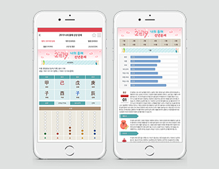
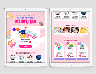
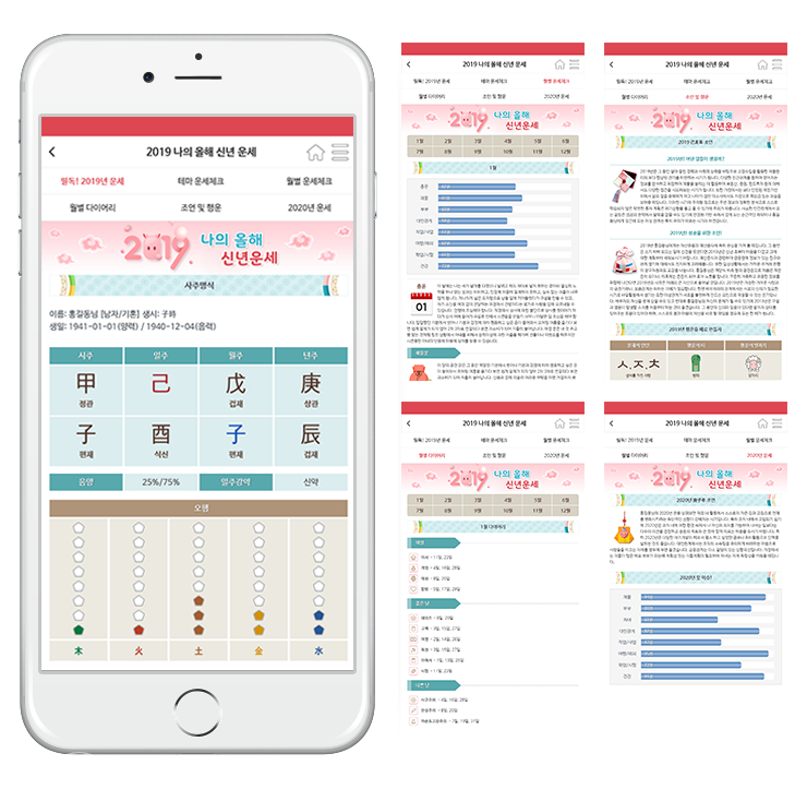
These are some part from mobile UI design of fortune luck content I designed in one of previous companies. I designed 9 fortune luck contents with similar layout and tone&manner, making diversity using variation in color and pattern.
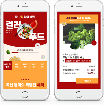
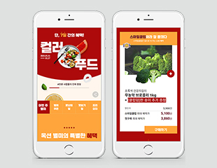
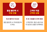
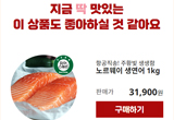
This is a color food-themed mobile promotion page project. I used Red, yellowish Red as main color which were known for stimulating appetite. Additionally, I used tone-on-tone color scheme using similar colors with main colors. I maximized usability by using .active class for the area currently visible.
Benchmarking - Planning – Design - Coding
2021.01.29~2021.02.06
Adobe Photoshop, Adobe Illustrator, HTML/CSS, Javascript, jQuery
#tasty #vitality #health
Gong Gothic, Noto Sans KR
#AC0A0A
#FFA53C
#FFF6EC
#6F1931
#F59AA9
Benchmarking - Planning – Design
2018.08.31~2018.09.03
Adobe Photoshop, Adobe Illustrator
NanumSquare, NanumBarunGothic
#FFC82F
#FD6710
#808080
#201E1F
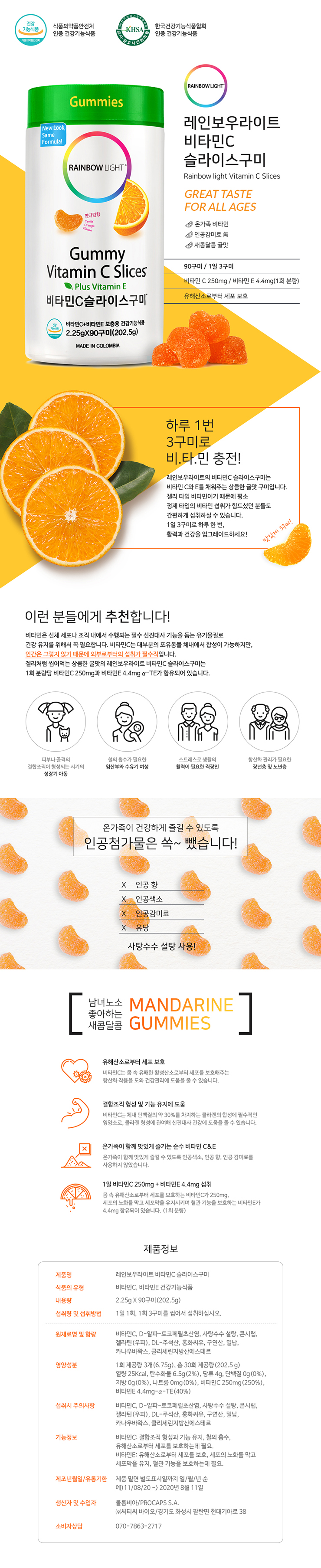
This is detail page design for promoting vitamin C slice gummies of Rainbow light. I expressed refreshing and sweet feeling of mandarine, using reddish Yellow of bright/vivid tone for large area. I used pen tool and blending mode for photo editing, focalized to make the ingredient/effect look well in the page. I also added icons for intuitively noticed page.

Benchmarking - Planning – Design
2018.09.03~2018.09.10
Adobe Photoshop, Adobe Illustrator
Arita, NanumBarunGothic
#03072A
#9EC1D4
#484848
#FDFFFE
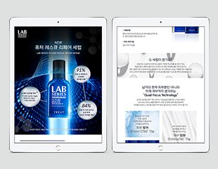
This is detail page for promoting serum for men. I put the most important information at the top of the page to inform consumers of the function/necessity of serum. Furthermore, I tried to arise consumers’ interest by arranging pictures which is suggestive of the texture of the product with text introducing the unique technology. At the bottom of the page, I put use order introduction of a set of products including this product so that consumers will get curious about other products of this brand.
Benchmarking - Planning – Design
2018
Adobe Photoshop, Adobe Illustrator
Kozuka Mincho Pro, Kozuka Gothic
#2D430C
#619848
#EAD721
#DFE1DF
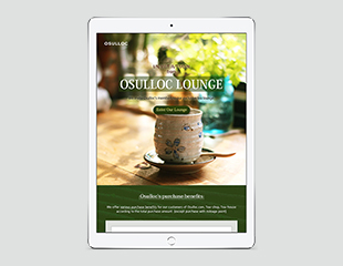
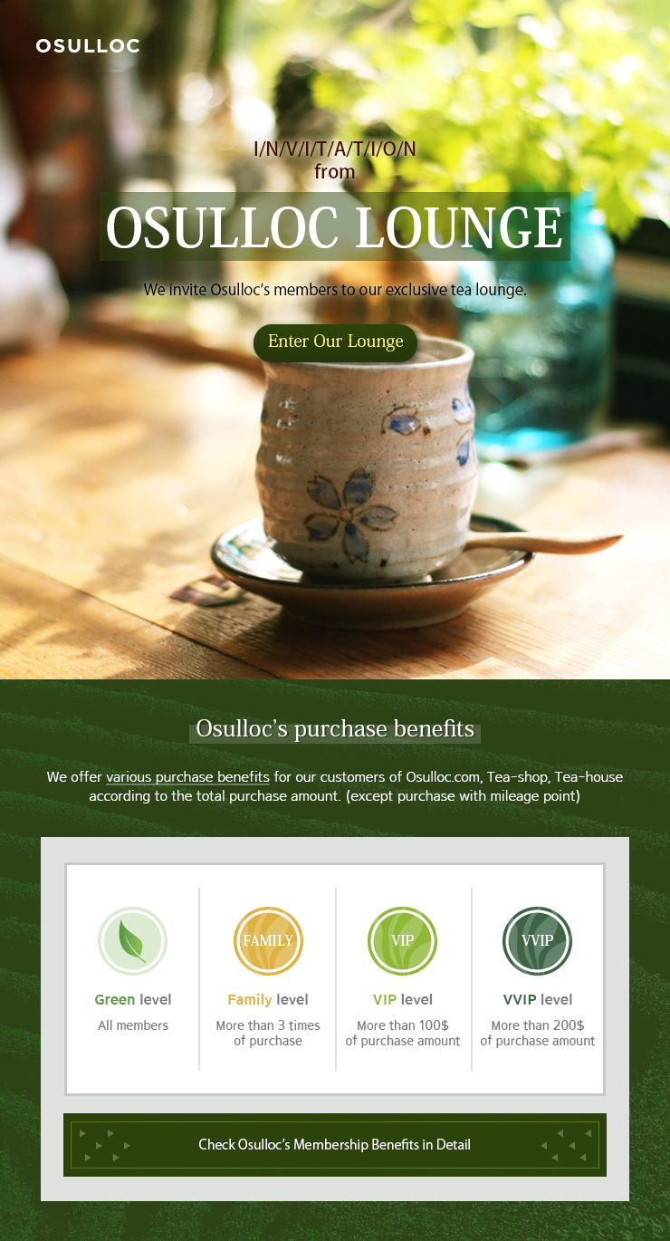
This is an English promotion page which introduces exclusive benefits for OSULLOC members. I used images and colors which can maximize natural and refreshing mood of the brand. I also put a button that makes consumers move to another page where they can check detailed information. Additionally, I made each image and text look natural together by using blending mode and opacity.
Benchmarking - Planning – Design
2018
Adobe Photoshop, Adobe Illustrator
Kozuka Mincho Pro, Kozuka Gothic
#47484A
#5C5D61
#B7B8BA
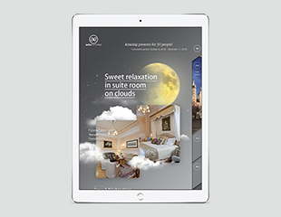
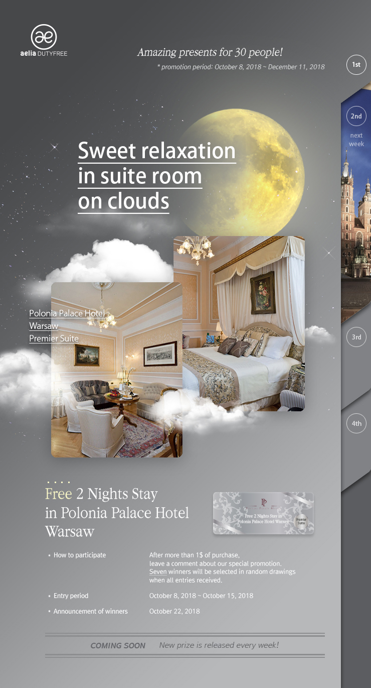
This is an English promotion page which can be used on Aelia dutyfree website. I chose “Sweet relaxation in suite room on clouds” as the theme of this page. Thus, I put pictures of hotel suite room under the moon so that it looks just like the room is floating around with clouds. I arranged index numbers at the right side of the page, because the winners of the promotion will be announced through 4 times of promotion period.
Benchmarking – Design
2021
Adobe Photoshop, Adobe Illustrator
Sandoll Odongtong, SpoqaHanSans
#FFD4DC
#9D89EA
#FF2A93
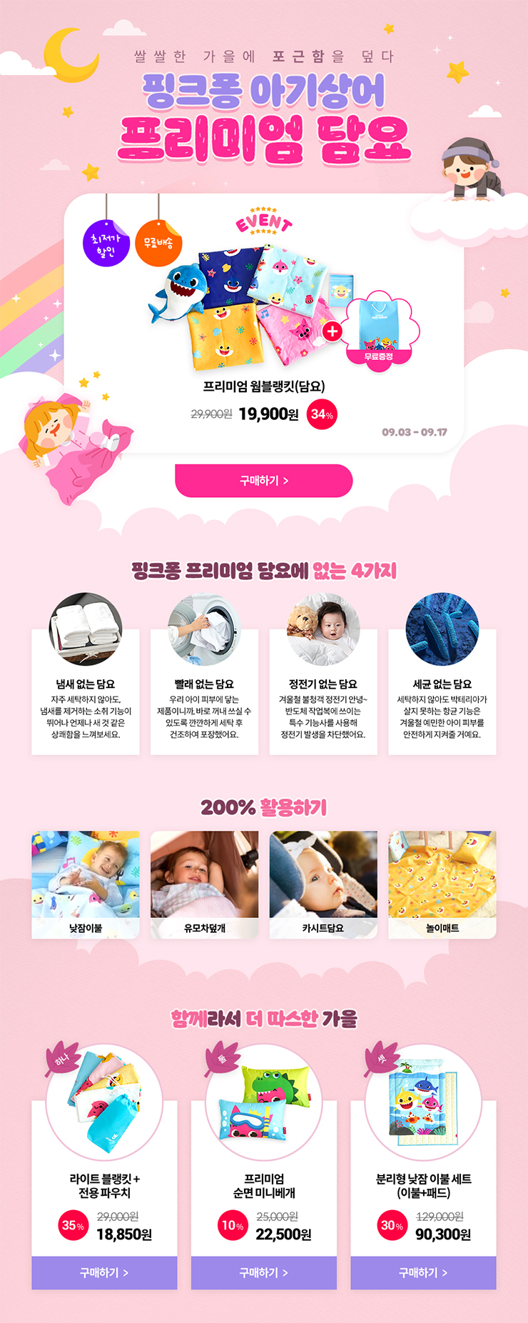
This is a promotion page which is aimed at potential customers of Pinkpong blankets. I mainly used colors of light Grayish tone to maximize the cute and friendly mood in the whole page. I used each different font’s size, color according to importance of each element.
Benchmarking - Planning – Design
2018.10.07~2018.10.08
Adobe Photoshop, Adobe Illustrator
Korean TitleGothic, RixJGo, Nanum Pen Script, NanumBarunGothic
#FFCF61
#FFF2BD
#ED008E
#FBAD17
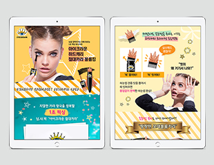
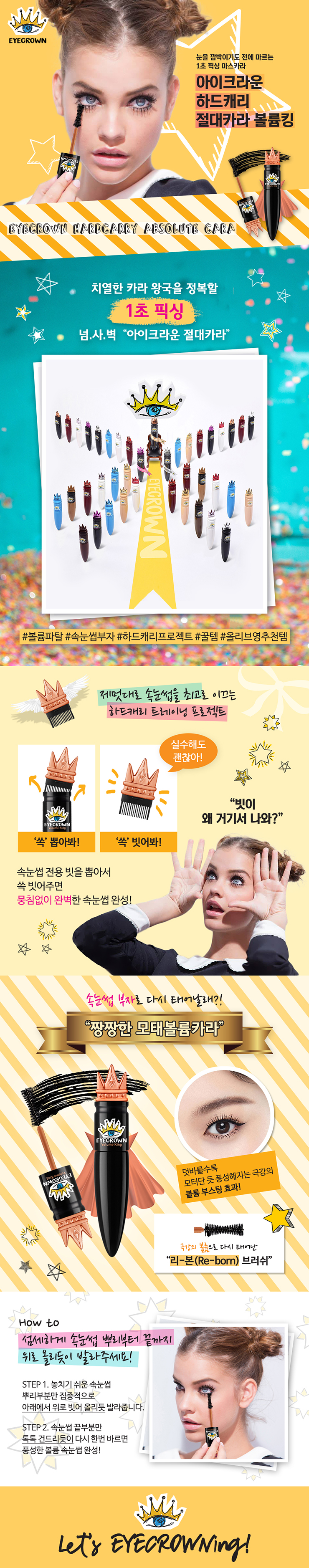
This is a detail page I designed for promoting EYECROWN mascara. Prior to design, I chose a model who fits the image of the brand. In the design process, I chose yellowish Red of light tone which matches cute and distinctive image of the brand as main color. As point color, I used reddish Purple of vivid tone to express the brand's vibrant and vivid image.

Benchmarking - Planning – Design
2018.06.28~2018.07.01
Adobe Photoshop, Adobe Illustrator
RixGo, Nanum Gothic
#5F6369
#E8E9EA
#F30B0B
#E5EEEF
#005A64
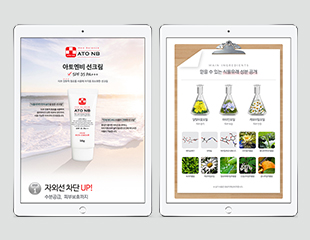
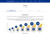
This is a detail page for promoting ATO NB’s sun cream. Considering the strong point of the brand, I mostly used nature-friendly and intimate images. I used Red of vivid tone which was extracted from the existing brand logo to heighten the effect of emphasis. I also used bluish Green of dark tone and Gray, to give variety to elements of the page. At the area which can be displayed visually, I put icons and a graph to make consumers understand about the product better.
Benchmarking – Design
2021~2022
Adobe Photoshop, Adobe Illustrator
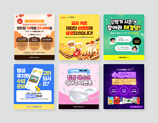
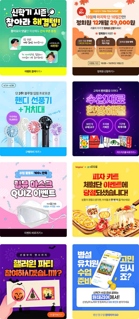
This is an online content design for SNS uploads that I created while working at the company. I utilized appropriate illustrations and color schemes to effectively convey the intended message within a limited space.
Benchmarking - Planning – Design(+logo/business card)
2018
Adobe Photoshop, Adobe Illustrator
Mont ExtraLight, Mont Heavy
#FAD4DF
#636FAB
#FFFFFF
#08070A
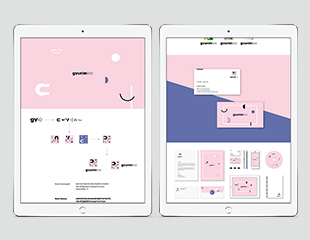
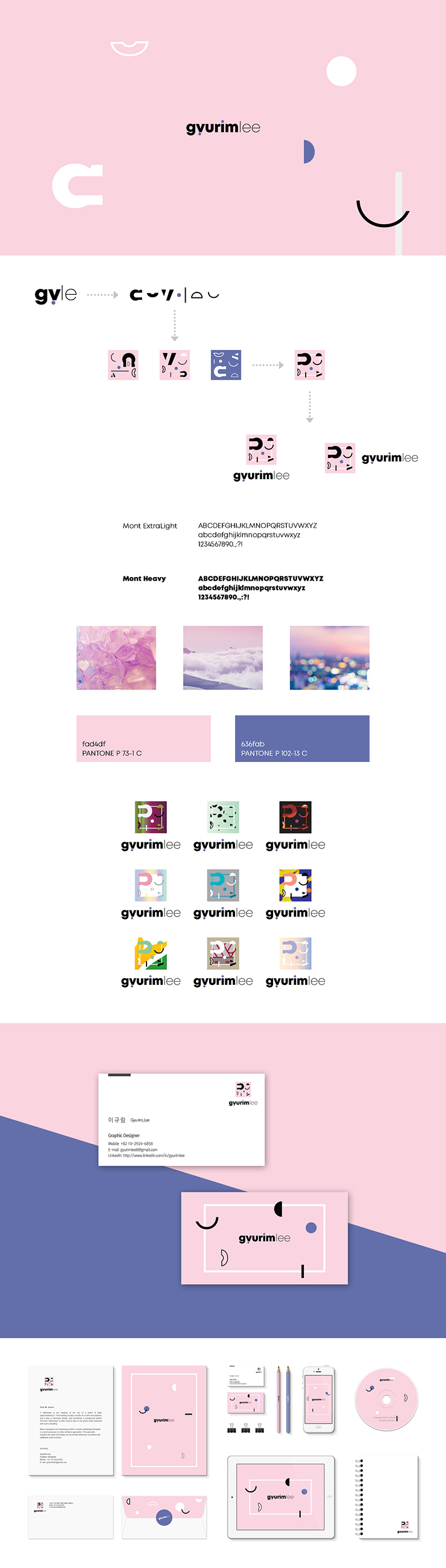
This is renewed version of my personal branding, which was also accepted for the 7th Seoul cyber national design competition. This time I designed two types of logo, by changing/rearranging the typo of my English name. One of the logo was used for my own portfolio website, with a simple change of its point color.
Benchmarking - Planning – Design(+typography)
2013
Adobe Photoshop, Adobe Illustrator
RixGo
#A70E13
#8E0B19
#565656
#FFFEFF
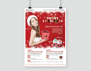
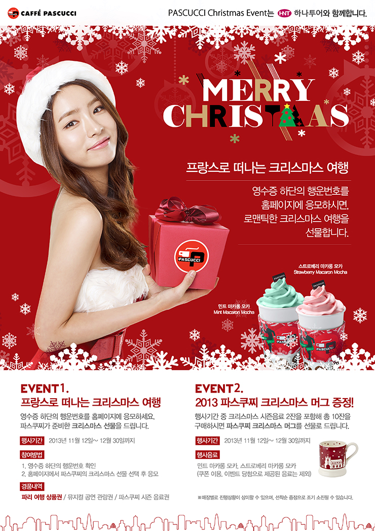
This is a promotion poster for promoting new Christmas beverage of CAFFE PASCUCCI. I used colors which is suggestive of Christmas and Santa Claus. I organized a multifarious screen by diversifying size and opacity of snowflakes in the background area. I also diversified size of line city illustration, to bring fun and charming mood.
Planning – Design
2013
Adobe Photoshop, Adobe Illustrator
RixGo, RixMj, SeoulHangang, Kozuka Gothic
#0C0F16
#111F46
#929898
#FFFEFF
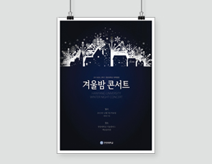
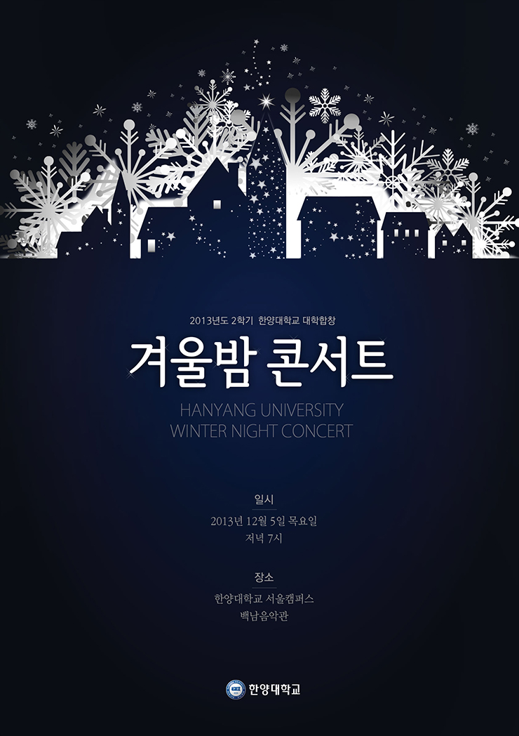
This is a promotion poster I made to inform people of a final-term choir concert. Since the date and time was 7pm in December, I named the concert “Winter night concert” and expressed a Winter night scenary. This poster was actually put on the front door of the concert place.
Planning – Design
2017
Adobe Photoshop, Adobe Illustrator
Nanum Gothic
#F2B0CC
#FFE945
#44A1FF
#3C3C3C
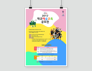
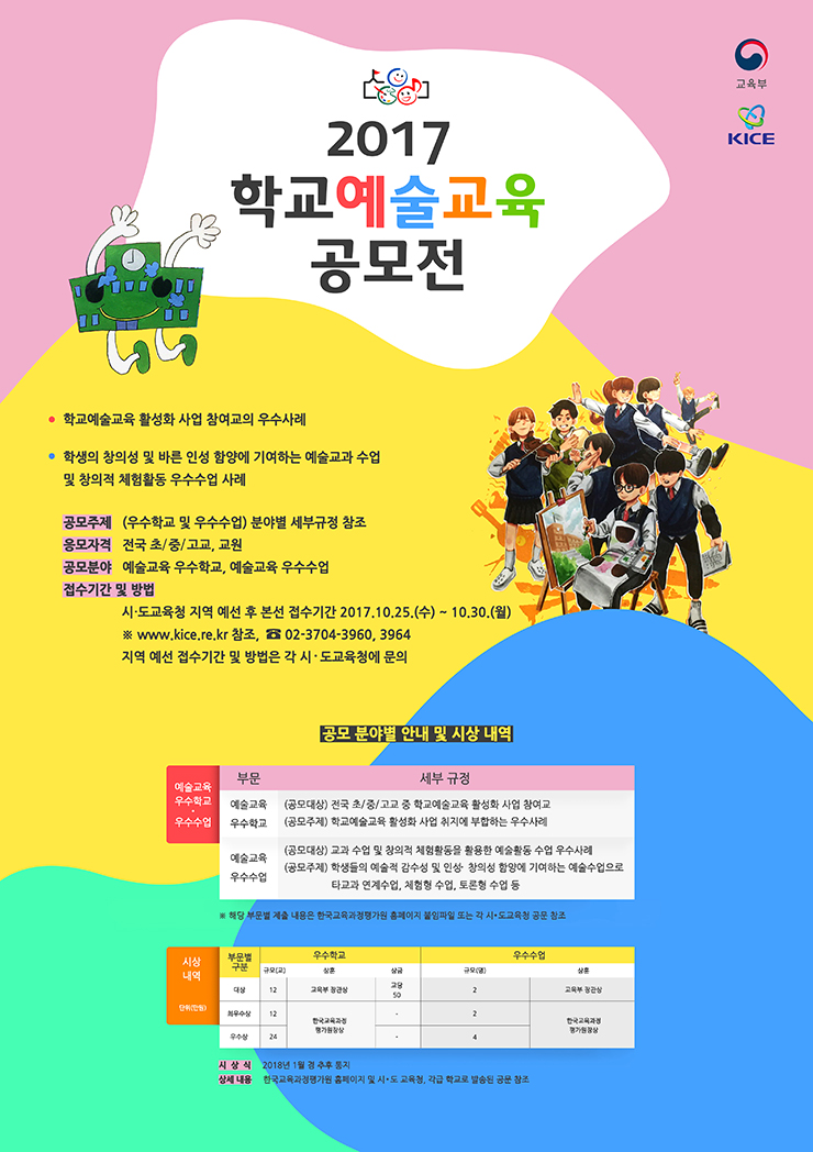
This is a promotion poster for informing people of information of 2017 School Art Education Contest sponsored by the Korean Ministry of Education and Korea Insititute of Curriculum & Evaluation. I used prize-winning of 2016, and various colors which can portray unique characteristics of Art education. By using curves with the overall layout, I tried to bring the creativity and freedom of Art education to this poster. I also chose Gothic fonts for readability.
Benchmarking - Planning – Design(+logo)
2020
Adobe Photoshop, Adobe Illustrator
Youth
#24CBBA
#231F20
#FFFFFF
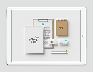
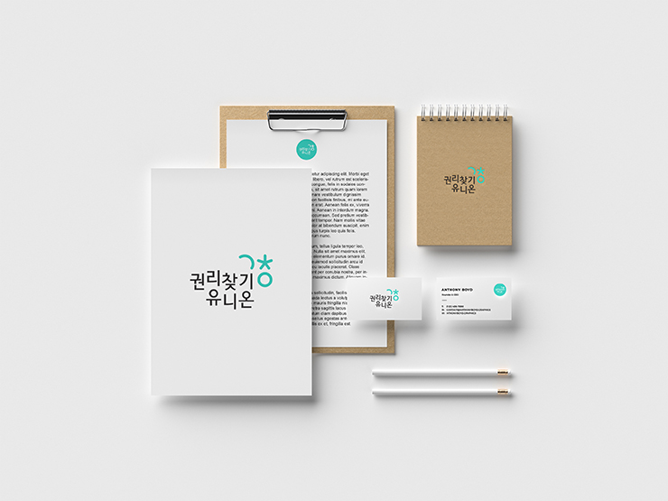
This is a logo I designed for a group to participate in a competition. The group requested that the existing Mint color be retained, so I used the same color. The symbol is a stylized representation of the first consonants of the three Korean characters '권, 찾, 유' in the group name '권리찾기유니온'. The three shapes respectively symbolize 'a hand reaching out to encourage finding rights together', 'each individual seeking their rights', and 'a world where all workers are free from discrimination'. Since the group name is a compound word, I varied the heights of the characters to create a sense of rhythm, taking both readability and aesthetic appeal into account.
Benchmarking – Design
2022
Adobe Photoshop, Adobe Illustrator
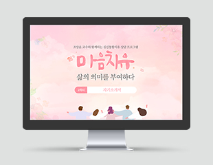
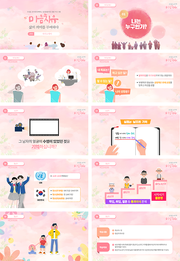
This is an e-learning content design I created while working at the previous company. Given the theme of 'healing' and the educational purpose of the content, I focused on designing with high-brightness warm colors that are easy on the eyes, even during extended viewing.
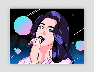
Sketch - Coloring
2022
Digital Art
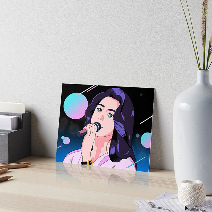
This is inspired by a musical genre called "Citypop", which I enjoy listening to.
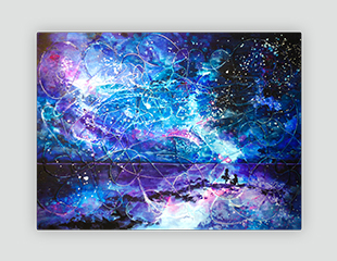
Sketch - Matiere work - Coloring
2014
Watercolor, Poster color, White glue
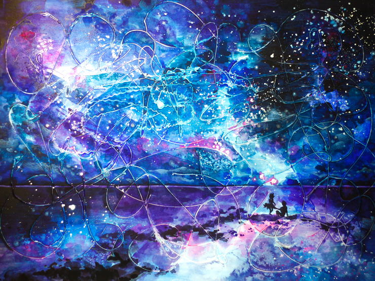
This is an imaginary painting which was used matiere technique. I represented united 2 worlds by the vague boundary between the sky and the horizon.
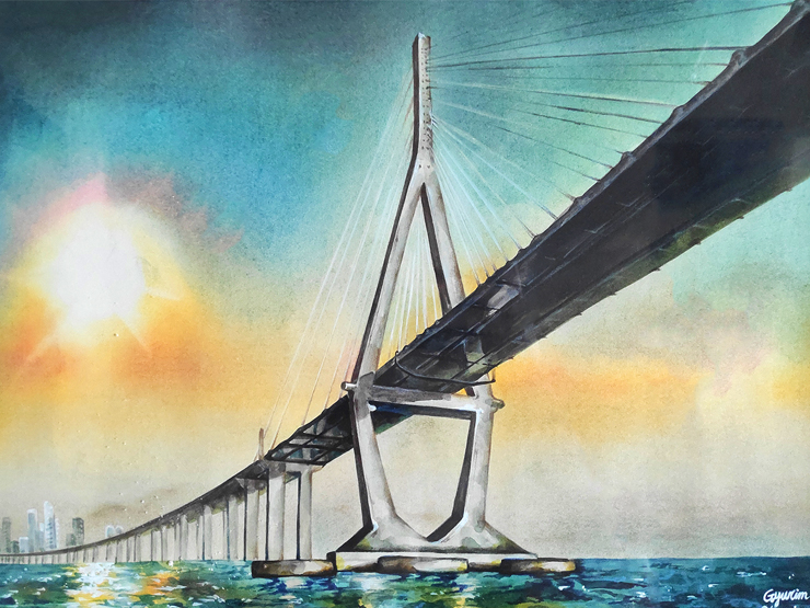
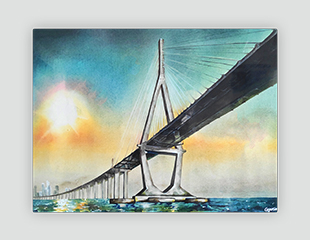
Sketch - Coloring
2016
Watercolor, Poster color, Pastels
I expressed the feelings I get when I think of the word 'hope' in the form of Incheon Bridge where the sun rises in the morning.
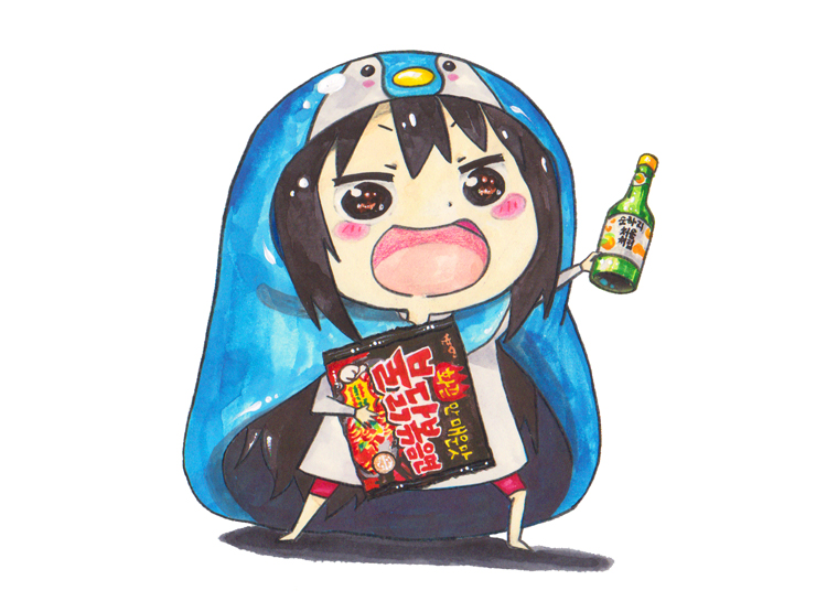
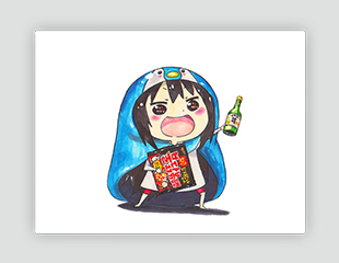
Sketch - Coloring
2016
Watercolor, Poster color, Markers, Color pencil
Inspired by an animation character called Umaru, I expressed the image of a homebody who recharges energy when alone. I also drew the penguin blanket and other things that I like together.
Thank you for watching! Did you like my portfolio?
Drop me a line via this form below. I will reply as soon as possible. :)